Choosing Grout Colours: The Designer’s Dilemma

When designing a bathroom, one of the most overlooked and underrated details, in our opinion, is grout colour! Making up a large portion of the visible surface area between tiles, the grout colour you choose can dramatically impact the overall look and feel of the space, and either complement or contrast your tiling scheme. As interior designers with specialisms in bathroom interior architecture, we’ve learnt some key tips and tricks along the way for selecting the right grout colour for every space and tile choice.
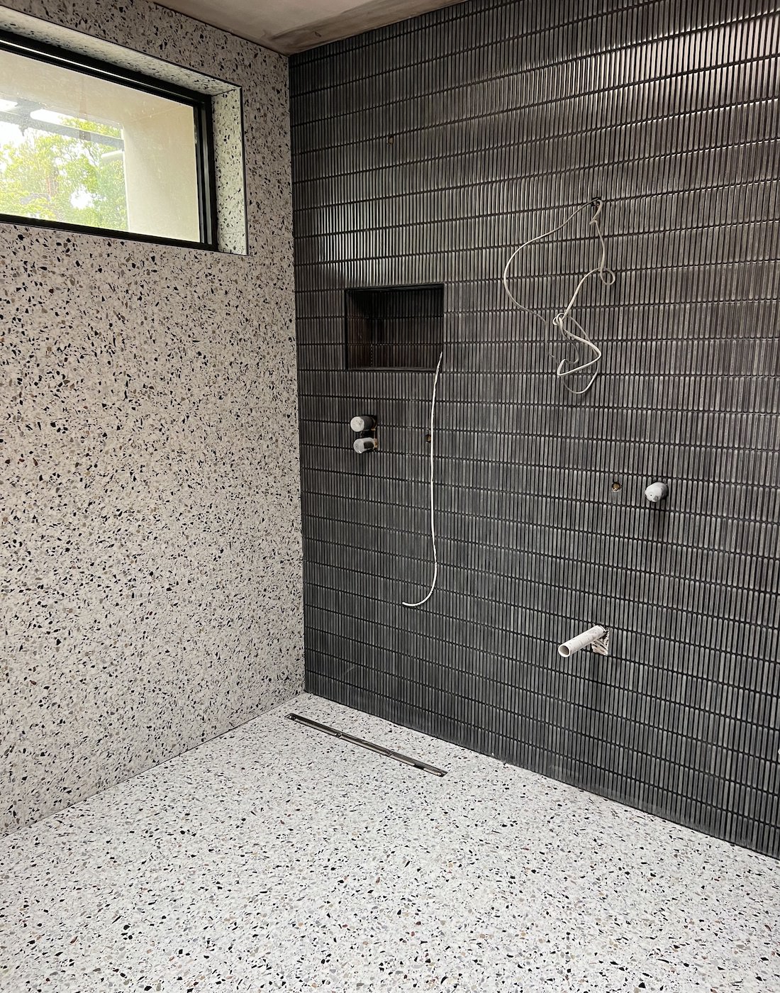
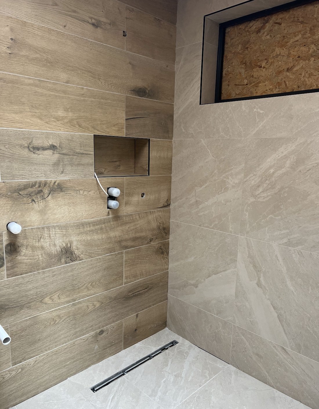
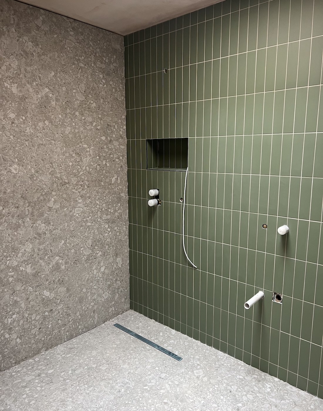
Work in Progress Bathrooms – Complementing grout and tiling vs. contrasting grout lines
Complement vs. Contrast
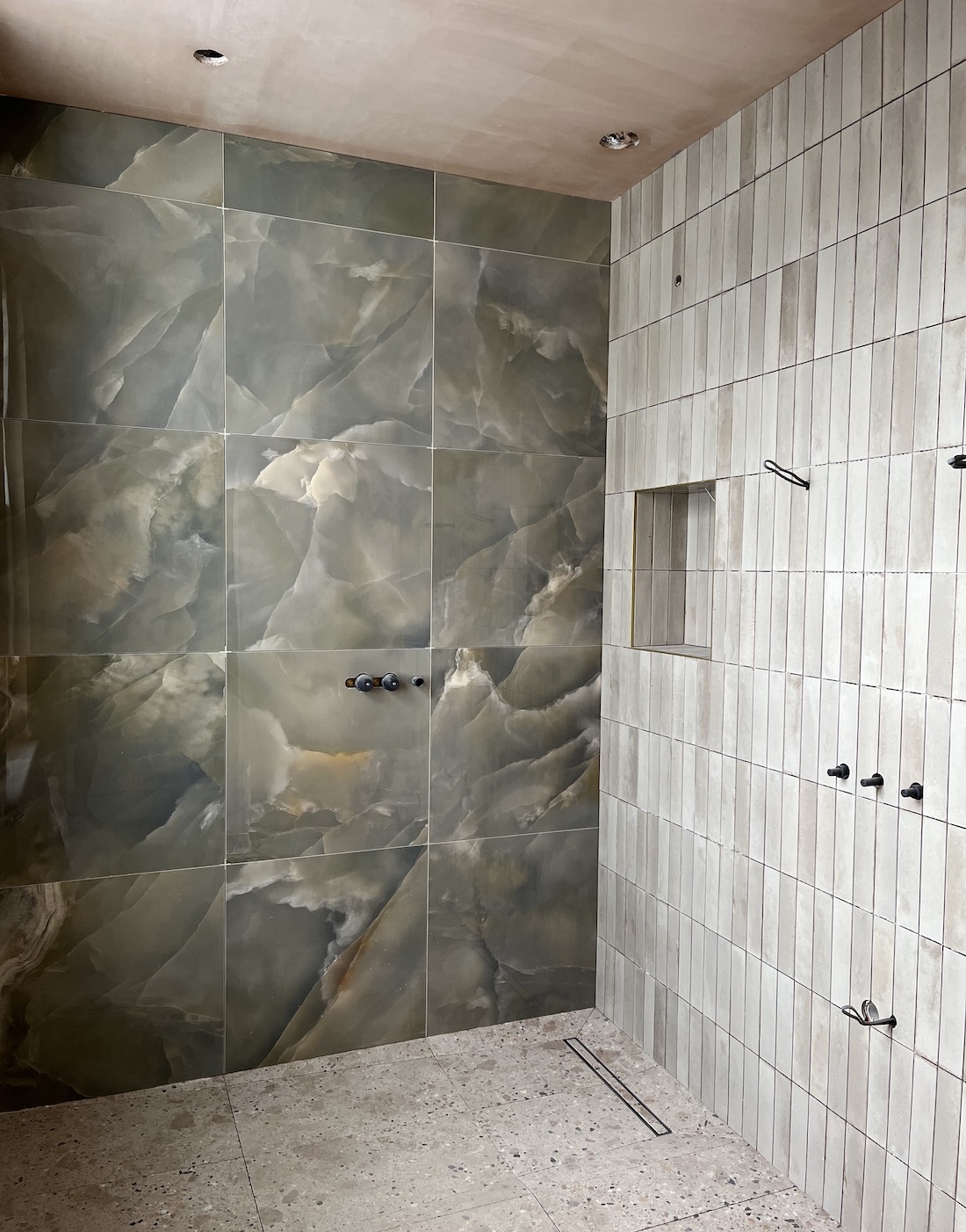
The first decision for any grout choice is whether you want it to blend the tiles to the wall or allow them to stand out in contrast. See above where we’ve created this dark bathroom scheme to include a dark grout colour, accentuating those moody and masculine themes. Compare this to the wood panelled bathroom with a classic light grout colour, which allows each plank to be seen separately.
Matching grout colour to your tiles creates a seamless, monochromatic look; the overall scheme becomes the focus, with the grout and tiles blending together. This approach works well for both bold, statement options like our Kit Kat tiles to really highlight that key colour scheme, as well as for more subtle tiling where you don’t want the grout calling attention to itself.
On the other hand, choosing a contrasting grout colour allows grout lines to become a design feature in their own right. The bold lines act as a grid that adds visual interest to the tiles allowing each one to be seen individually. This grouting technique works best with a simple tile pattern or solid tile colour, allowing the grout to provide that added visual texture and depth to the scheme.
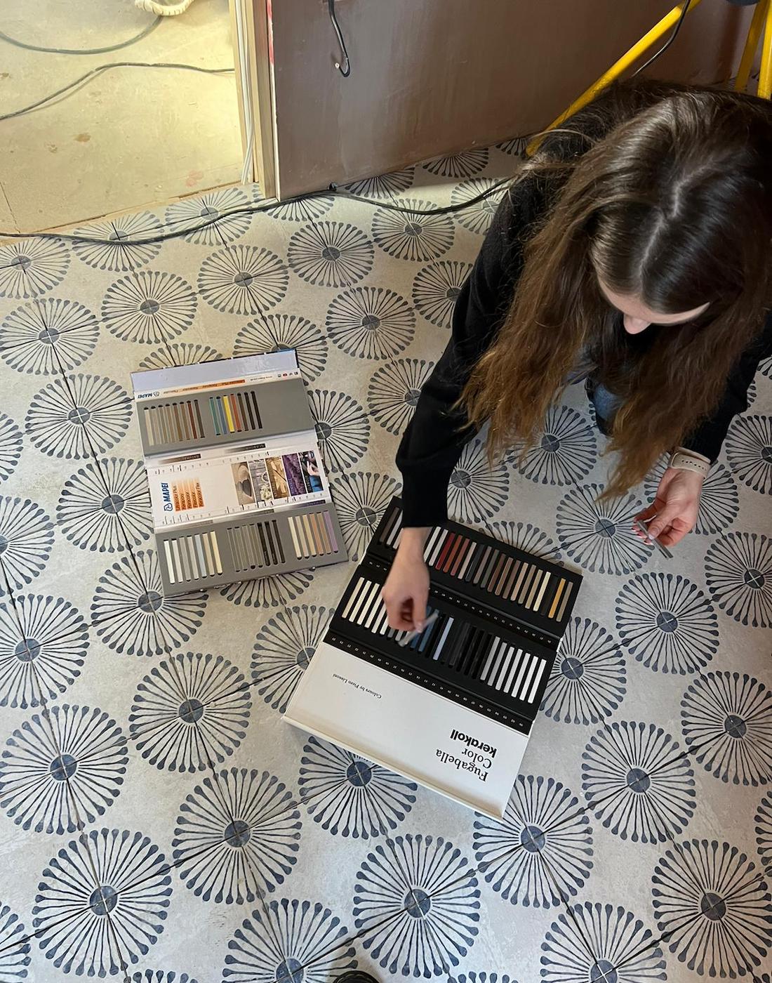
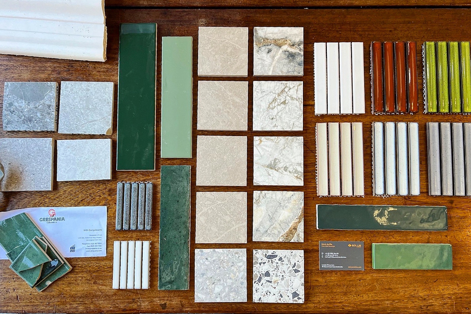
Deciding the right grout for patterned tiles – Making final decisions on site
Factor in Tile Color and Pattern
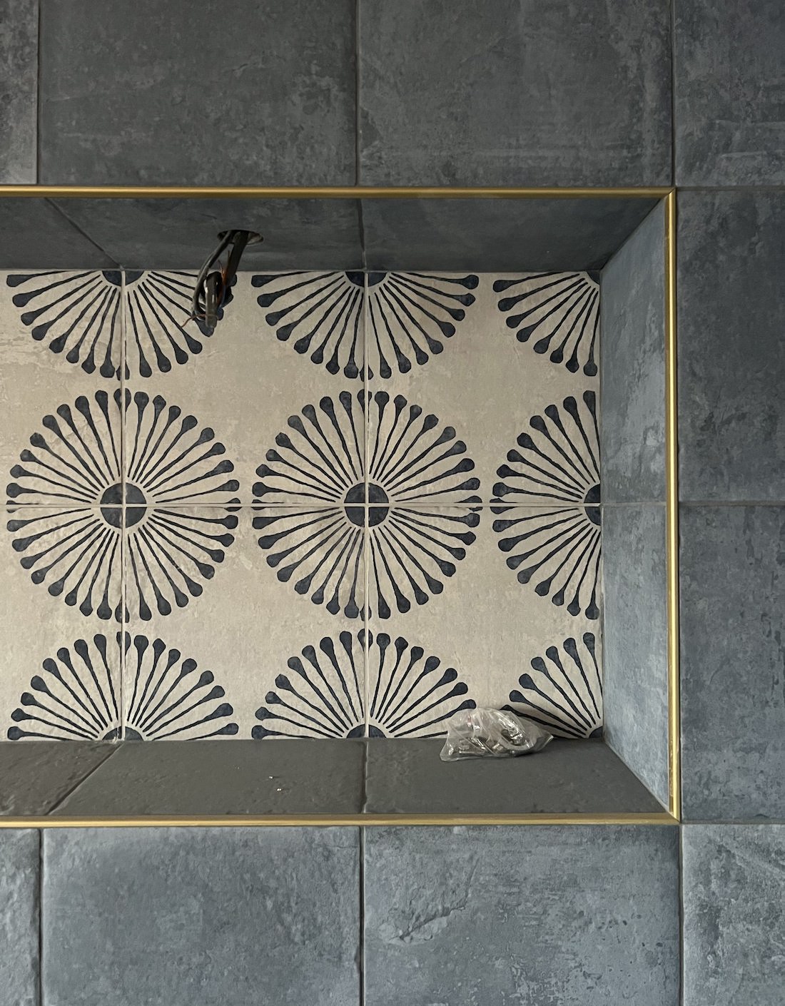
Keep in mind that the specifics of your tile design will determine whether complementing or contrasting grout works best. For example, an intricate mosaic tile with multiple colours and shapes will look cluttered with high-contrast grout. A contrasting grout highlights and accentuates a tile design, so make sure your chosen tile can stand up to that attention.
Likewise, grout that matches too closely to a busy tile pattern can sometimes get visually lost, creating a dense or domino effect particularly in very dark schemes. If colour matching isn’t an option for your chosen style, going for a slightly lighter or darker shade of grout can provide a much needed delineation between each tile.
Similarly with solid coloured tiles, be careful when trying to colour match the grout exactly, even a slight variation in hue will be highly noticeable and read as contrast.
Overall, patterned tiles can be tricky to decide on a design direction and sometimes your best bet is to wait until they are laid to get a good feel for what the grout colour should be. See here, our Senior Designer, Jenna, getting into grout specification on site once they’ve begun to be laid. Here we opted for a matching grout effect allowing the pattern to be the visual statement.
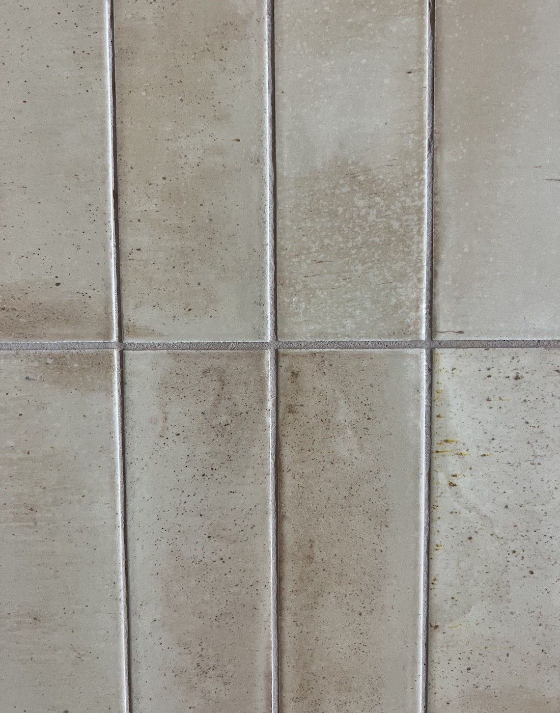
Before and After – Complementing grout colour in a slightly darker shade than the tile
Finally, Consider Maintenance
Grout colour significantly affects how much ongoing maintenance your bathroom will need. Light grout shows dirt, grime and discolouration much more readily than darker shades, and particularly white tones of grout will require diligent scrubbing to keep it looking crisp and clean long-term. On the other hand, soft grey or beige grout is much more forgiving and will hide stains well over time.
Taking into account the amount of cleaning you’re willing to put in when opting for lighter grout with high visibility will dramatically change how you feel in the space long-term. But bear in mind, there are maintenance options like grout sealers which will help you sustain and protect lighter grouts from absorbing stains over time.
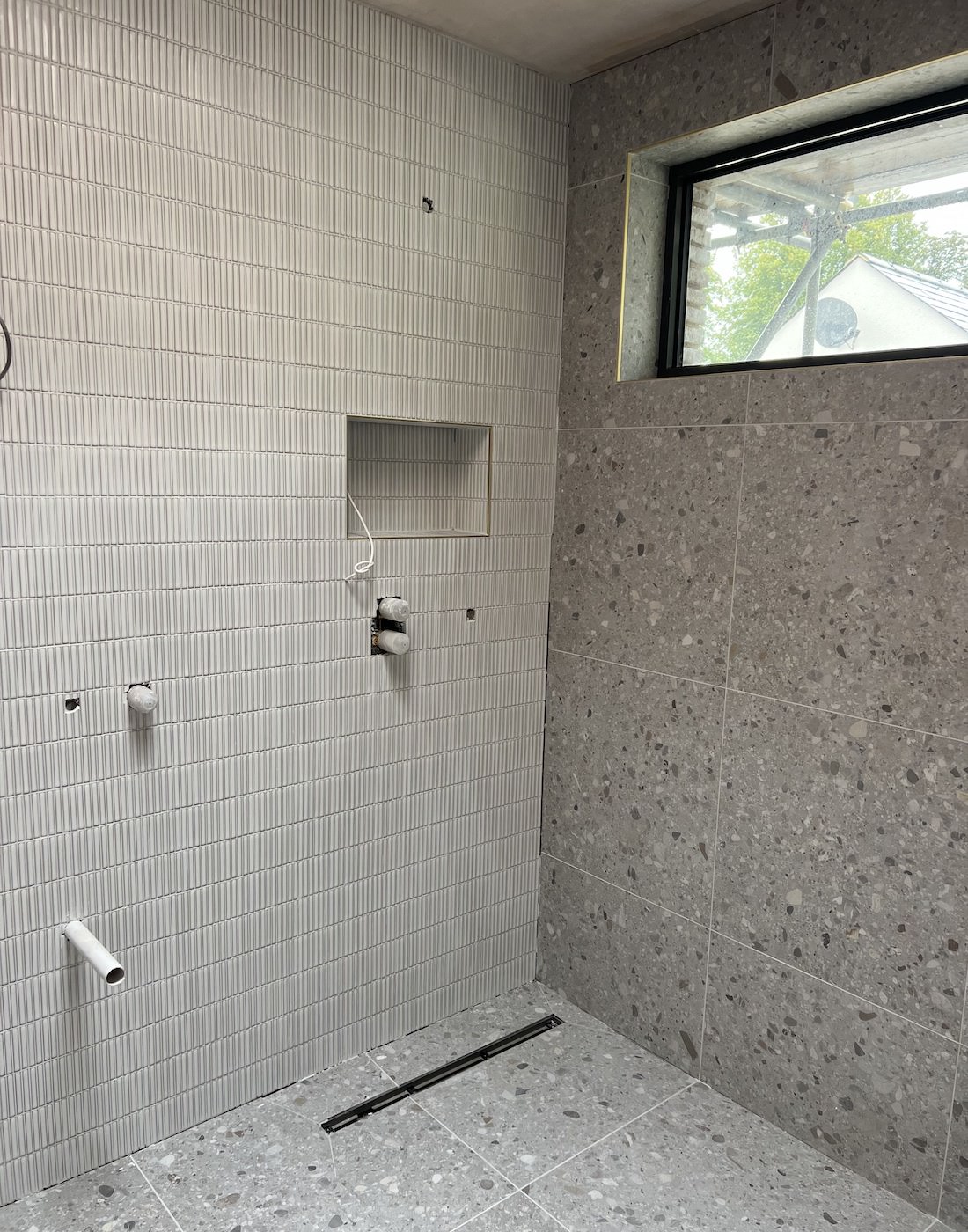
Complementing and contrasting grout colours – some Work In Progress Bathrooms
At the end of the day, the possibilities are endless when selecting the perfect grout color. Whether you want the grout to fade into the background or make a statement in the foreground, choose a colour and texture that complements the overall design vision.
As always, don’t be afraid to have fun with your grout colour choice, allowing this often-overlooked detail to shine! However, if you need help, we are on hand every step of your project to make your bathroom design as smooth and painless as possible.
Looking for interior inspiration? Explore our recent work or contact us for a design consultation
Find InspirationRelated Stories

Dopamine Décor and Mood-Boosting Interiors

The Pfeiffer Design Series: First Projects & Embracing a New Era
Christmas Styling Trends for 2025: Warmer, Bolder and More Creative
2026 Interior Design Trends: Styles That Will Shape Your Home
Contact Us